
The music of geography: Ohio is a piano
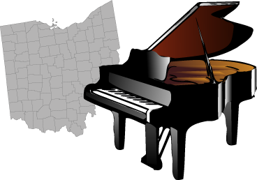
Last month, as I was driving through Ohio to collect my final three counties in the state, it dawned on me: There are 88 counties in this state. There are 88 keys on a piano. I don’t know anything about music, but holy crap, I have to make a map based on this coincidence.
And so I did, bit by bit, gradually descending into madness in the process. It has no purpose, really, apart from being an experiment in some sort of weird artistic musical cartography. Ohio is a piano. Check it out. (It’s in Flash.)
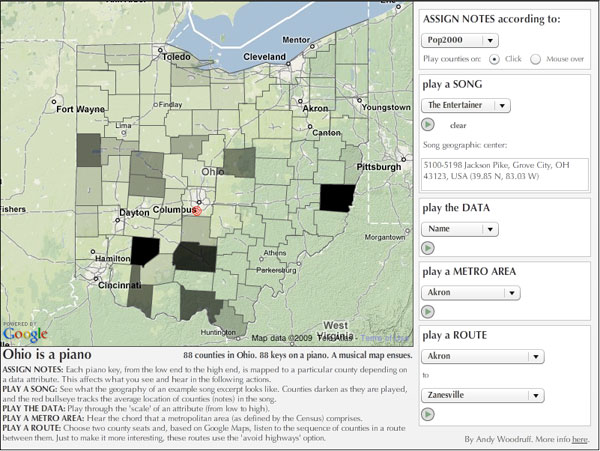
The premise is simply that each of the 88 piano keys is assigned to a single Ohio county. How the keys are mapped to the counties depends on a specified data attribute: the notes and counties are ordered by that attribute and then linked to one another. For example, if the chosen attribute is population, the county with the lowest population is assigned the lowest-frequency piano key, the county with the highest population is assigned the highest-frequency piano key, and so on. The data I have here are a little out of date, but that doesn’t matter for demonstrating the idea.
There are many directions one could go from here. I have chosen a few ways to see the geography of music (songs) and hear the music of geography (data, metro areas, or sequences based on Google Maps routing).
In my experience, most of it sounds like crap, apart from the provided simplified bits of actual songs of course, although even those might sound wrong (but hey, blame the sheet music I found). (Update: Screw it, the Beethoven piece was too horribly out of key, so it’s gone.) But I would be very interested to hear if anyone discovers any patterns that sound decent.
What’s missing, of course, is the ability to compose your own geographic music, that is, bringing in your own songs, sequencing counties into songs, seeing the data and grouping it in different ways, making your own chords and routes, and so on. That and controlling the music from the piano as well as the map. Compositionally, for now you’re stuck with just moving the mouse over the map, but perhaps you can imagine how this concept could be turned into a full-fledged crazy musical cartography application.
A couple final caveats: 1) the piano sounds are exported from GarageBand and on the high end don’t seem to sound great, and 2) this little application is not at all idiot-proofed, so my apologies if you are an idiot. This is just a demonstration of a ridiculous concept; it’s hardly worth the effort to make it a well-designed, smoothly functioning application. For now, no stop buttons, nothing to keep you from playing a cacophony of all the options at once… go nuts, it’s kind of more fun anyway.
Cartographically speaking…
Sonification of data is reasonably commonplace: think metal detectors and Geiger counters. Representing spatial data using sound is a subject about which I know little, but it is an active research topic in cartography. Obviously what I have made here is necessarily an example of mapping with sound, although I don’t believe it to be especially useful for understanding data. It is, rather, artistic in intent, allowing one to hear the “music” of the data and geography (whatever that means) rather than actually explore the data values.
Many, if not most, endeavors in using sound for thematic maps will refer back to a 1994 article by John Krygier (my future undergraduate advisor at Ohio Wesleyan University) called Sound and Geographic Visualization. He has reprinted the article on his Making Maps site.
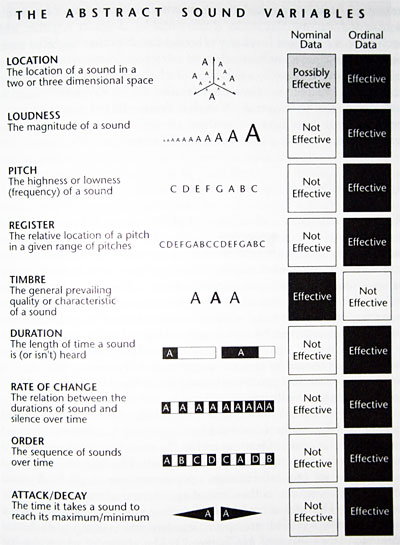
Krygier proposed explaining audio maps through a set of abstract sound variables (above, as reprinted in Alan MacEachren’s How Maps Work), analogous to Jacques Bertin’s graphic variables that are a basis for ordinary thematic mapping. Relative differences in these variables can be used to make data comparisons. Following the path from Krygier’s article will take you to a number of examples of further research or attempts to use sound to enhance or independently convey map data.
Using sound for thematic mapping has also been of interest to those seeking to assist blind or otherwise visually-impaired map users. The HCI folks at the University of Maryland, for example, have worked on software for that purpose. (And I believe I’ve seen Maryland names, such as the famous Ben Shneiderman, on more general articles about using sound to represent map data.)
Anyway, like I said, it’s not an area of my expertise. I’ll just stick to the impractical, wannabe artsy stuff.
Tagged frivolous, map projects, ohio, sound
56 Comments